This article covers some of the cool features of Crunch that you shouldn't miss as you you're getting to know it. Crunch is releasing new features all the time, so don't be surprised if this simple list gets out of date pretty quick - keep your eyes on our new release updates to stay up to speed on the great new cool things you can do in Crunch.
- 3-way tables (sometimes called multiway or 3D tables - because you can use 3 variables)
- Geographic maps (sometimes called a choropeth)
- Grids and scorecards
- Time series charts
3-way tables
3-way tables let you look at 3 variables at once. For example, you want to look at the grid of NPS scores (Age in the rows, and Gender across the columns, and the NPS score in the cells).
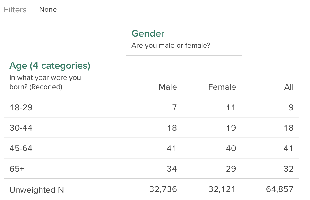
Consider the table of Age x Gender below, where the cells are showing the column-% for Age (eg: 7% of Males are 18-29).
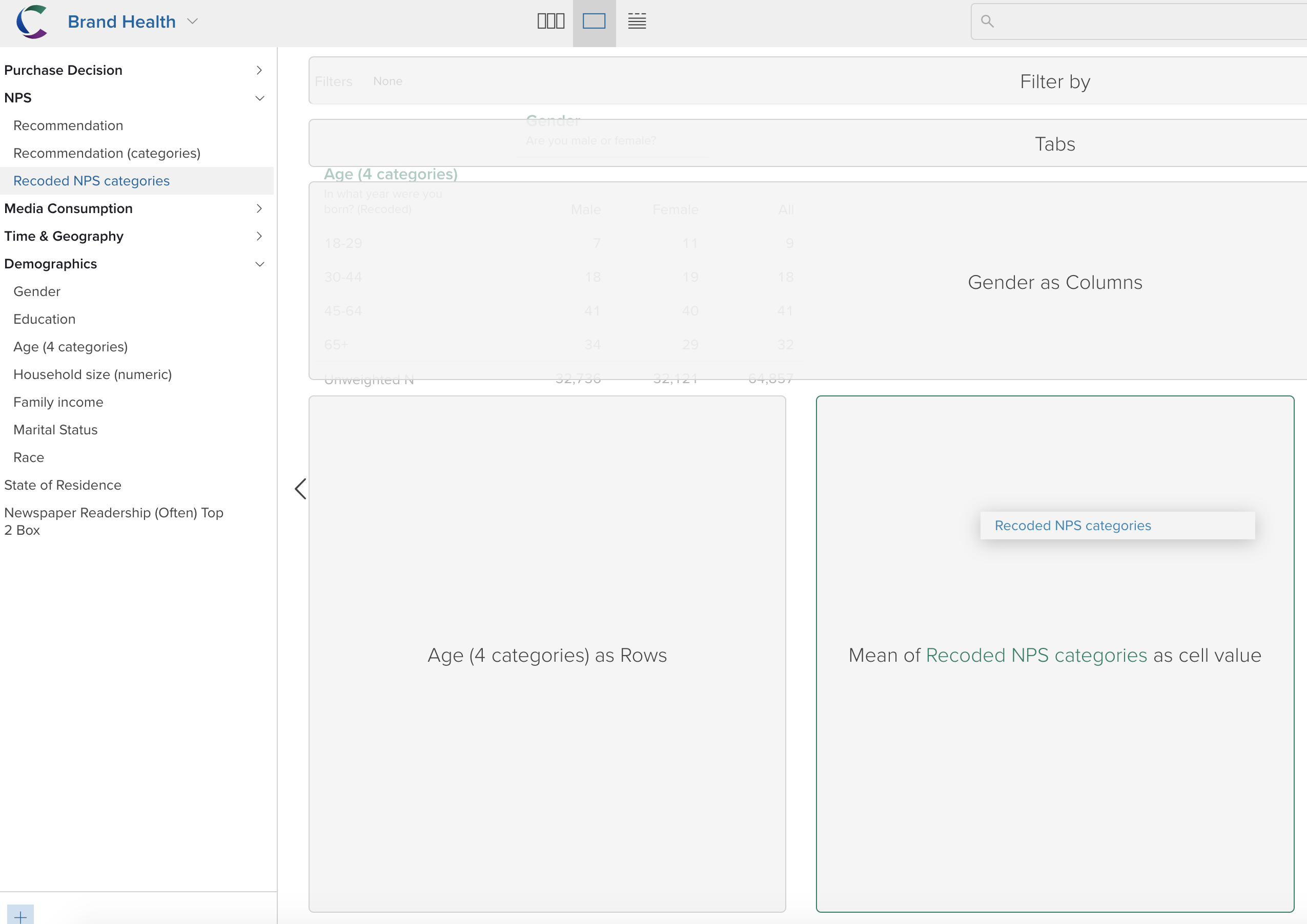
What if you were interested in looking at a grid where instead of the column-%'s, we had the NPS scores? Easy - just drag over the relevant variable (in this case a variable called NPS Categories) into the As Cell Means dropzone).
Then the table will change, displaying the cell means above the column header, and the cells will be the mean values of the third variable.
Geographic Maps
A choropleth shows data on a map by filling regions with colors along a scale. The simplest map will show the count or percentage of respondents in each region, just like a table, using a color scale designed for accurate identification of values, perceptual equivalence across its range, and usability for people with different color vision.
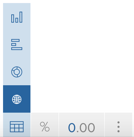
To make a choropleth (geographic map), you need to have a geographic variable in the rows of your table. You'll know it's a geographically recognized variable if the Display Controller gives you a little globe in the Tables and Graphs View, like the image below. Remember, Crunch will only give you the chart type options that suit the variables you're using in the table.
Time-series charts
Simply drag a date/time variable to be the columns of a table. This enables the option for a time-series chart.
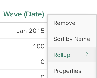
Remember date/time variables can also be rolled-up easily (to different time bands) by using the drop-down associated with the time variable.
Grids and scorecards
What if you want to line up variables side-by-side? This could be a selection grid of brand x attributes. It could also be a brand funnel (where you line up brands down the rows and different key metrics as columns, or vice versa). This is achieved in Crunch using the Scorecard feature.
See the following article to learn more about Scorecards (KPI summaries, flexible grids, and brand funnels):


