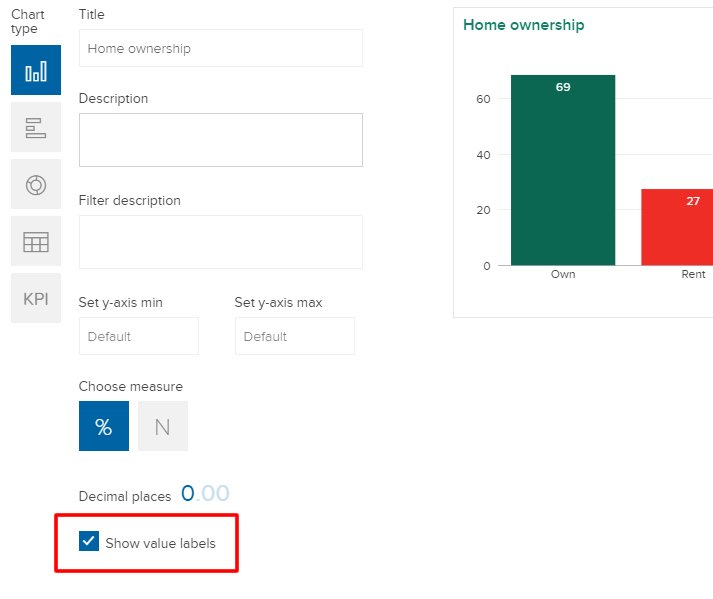
You can decide whether to show value labels for graphs and charts, both in 'Tables & Graphs' mode and on dashboards.
Showing value labels on graphs
Value labels appear as small numbers on graphs that show you the value represented by that bar/column/segment:

Enabling value labels
With the new feature enabled, value labels display on all graphs you create. With the feature turned off (by default), you must hover over a chart element to see a tool-tip with this value. If you're satisfied with the tool-tip approach, no further action is needed.
- Graphs made with this feature enabled will show these value labels to everyone.
- Donut charts will always show value labels, regardless of the user setting, since there's no scale to read the values.
If you'd like to instead have these values always display, you can turn this feature on via the three-dots  menu in the play-controller at the bottom of your screen, choosing the 'Show value labels' option:

Analyses saved to the deck will have this property saved with them, and this will then be reflected in the visualizations shown in a dashboard. But, you can override the saved setting from within the dashboard edit panel by checking the 'Show value labels' checkbox:
